As part of our promotional package, we have to design a website. We had our first lesson on website design the other day and we got taught about the key features of a website and what we need to think about when creating it.
In terms of creating the website, we need to think about the trailer we are producing, how it will link with our website and we will be inserting it onto the main page. We will also include information about the trailer and our narrative including the process of making the trailer.
We will upload photos and videos to the blog which will show all our location and the fun we had while taking part in the project. An idea we had for the website was a voiceover of some kind on the homepage.
In terms of the content on the website, we will consider the following:
Functionality
-how well the website operates
-access to the website and how easy it is for users to use
-speed, if we involve too much content that isn't really needed then it will take a long time for the website to load each page
-legality - this will involve us doing research about the rights of our website and what we cannot include e.g. copyright etc
Design
-Typography (which we have already been doing research on), range of fonts, colours etc
-Artistry -genre. We need to consider our genre to make sure that the website will link in and give off a 'horror' effect as out teaser will be for a horror film.
-User friendly - links in with functionality. We need to make sure our website is easy to use by our audience otherwise it will get a bad reputation and not many people will visit it.
-Clarity-make it clear. We need to make sure the website is clear and simple for people to use
-Aesthetics
-Colour harmonies - don't use colours that clash or aren't relevant.
Content
-Purpose - why are we designing the website, what does it need to include to be successful.
-Email lists, newsletters
-Fanbase
-Information process
-Verbal Expression
-Attention to detail
Originality
-Quality of predictive research
-Animations
-Distinctiveness
Overall effectiveness
-What wouldn't we like to include that has been featured on other websites.
-The strengths of the website.

Gabriella Freeman 5057 Annie Relfe 5445
Friday, 22 October 2010
Wednesday, 20 October 2010
Filming and Editing
We've got our filming well underway now and have about 1 minute in total at the moment. We have filmed on three different occasions and will hopefully only need to more filming days until the filming is finished!
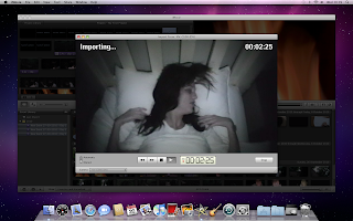
As the screen shot shows below we have started importing our filming onto the computer to start editing and began to edit it although it is hard to edit when we haven't got all of our footage as it is in a muddle and we can't do the clips in order yet as some clips go inbetween clips that we have filmed.
We have had problems with lighting in our film, especially when we did the bath scene because the light was reflecting on the water.
 Filming our protagonist having a nightmare was much easier as we needed dark lighting and were able to use the light on the camera to aid us so it is clear but not bright and audiences will be able to tell it was night time.

As the screen shot shows below we have started importing our filming onto the computer to start editing and began to edit it although it is hard to edit when we haven't got all of our footage as it is in a muddle and we can't do the clips in order yet as some clips go inbetween clips that we have filmed.

We have had problems with lighting in our film, especially when we did the bath scene because the light was reflecting on the water.


Thursday, 7 October 2010
Pulp Fiction
This is typography made for pulp fiction. Its interesting because it is a suitcase filled with quotes from the film.
The colour is mostly red implying danger and anger, this represents the film as it is filled with crime and dangerous drugs, fighting etc.
 The writing on the suitcase stands out against the background colour on the suitcase and the more well known quotes are in bigger size font. The writing is clear although it is vertical and horizontal. The suitcase is located more towards the top of the poster rather than the bottom but directly in the middle drawing the attention of people. The suitcase takes up quite a lot of space and it is filled with writing so it tells us what kind of genre the film is. E.g a lot of swearing will mean it will probably be an 18 certificate and a crime thriller.
The colour is mostly red implying danger and anger, this represents the film as it is filled with crime and dangerous drugs, fighting etc.


Wednesday, 6 October 2010

Friday, 1 October 2010
Poster Deconstructions


The Unborn poster has typical lighting for a horror film, the kind of light which is quite unsettling. The white writing stands out so it is clear what the title is.
The title on The Exorcism of Emily Rose is in red which is a typical colour for a horror film title and standsout clearly against the foggy background picture. The fact that we can't the girls face in this poster in unsettling as the audience are left to decide what her face looks like. The tagline is 'based on a true story' which is appealing to audiences and instantly makes them want to go and see it as if it wasn't a good storyline, it wouldnt have been made into a film and the fact that it is true will scare them more.
Subscribe to:
Posts (Atom)