Original picture of our protagonist for poster
Original handprint photograph before it was edited in Photoshop
In the process of editing in Photoshop and adding new layer
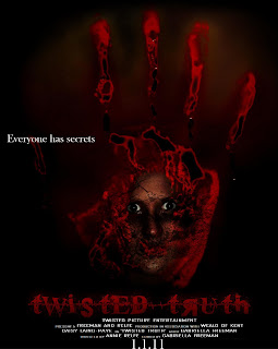
Final Poster
As the genre of our trailer was psychological horror, we needed to make it evident when advertising it, making the audience aware that it was a horror film. To do this we did research and looked at previous horror film posters and the colours used.
Inspiration from Gothika - a psychological horror. Similar narrative
We knew we would be using dark colours but the main colours that we found were black red grey and white. In our trailer, website and poster we have created, we have used the same font and the same colour for the font. This will help audiences to recognise the typography and automatically think of the product made. The typography is important because it is a clue about our genre and we have used conventions of a psychological horror.
Similar genre and protagonist story (psychologically ill, not aware of previous events). Use of red writing is bold.
The font is gives the audiences an uneasy feeling and had the look of a heart monitor. We have used the red font creating connotations of blood and evil on a black background as this links to conventions of our genre and makes it stand out. We have incorporated our protagonist into the poster and website from our trailer because she is a very important part and represents our products. Because we took pictures when we were filming that we planned to use for our poster, she is in character and has her hair, make up and costume the same. Audiences can relate the poster to the trailer and keep being reminded in different ways of the trailer. The homogeny was very important and we used the handprint photo (without the character in it) for the website background and the poster and it linked to the last shot of our trailer when she has her hand on the window.
Film from 1976, psychological horror focusing on female villain as the protagonist.
The websites we looked at for current horror films were extrememly helpful and inspired us a lot.
Black background with use of fire and characters in shape of a skull. Inspired us by using things in different ways.
Use of red for writing, trailer automatically playing on website. Character is a disturbed manner to show film is disturbing.
Use of red for writing, trailer automatically playing on website. Character is a disturbed manner to show film is disturbing.
All the websites were very dark and as they were all for our genre so we knew we had to make our website dark. We made sure we used conventions of film websites such as widgets for the use of convergence, sound automatically playing on the link pages and the trailer automatically playing on the homepage of the website.
Subverts our genre,
Use of red and black, little white. Research for poster. Red title, documentary image on front


No comments:
Post a Comment