As our genre is horror, we decided to look at some websites that have been made for well known horror films because making a website is part of our promotional package.
The picture above is a print screen of the homepage for 'Quarantine' which was a horror film made in 2008. At the top of the website page, there is a space which is dedicated to sony pictures, therefore the visitor to the site knows that this film was produced by Sony Pictures.
The website is mostly black matching the genre of the film and the other main colour used is green. This is used to represent nighttime vision as the whole film is filmed as a documentary and nighttime vision is used.
The catching phrase that is used to describe the film uses words like 'terrifying' and 'secret' which builds suspense and builds up tension for the audience.
The trailer appears on the screen and plays for visitors to the site so they can get an idea of what the film is about and the genre it is. Below the trailer shows quotes from critics and this appeals to the target audience of the film as they know it is going to scare them and give them a thrill.
The background of the website uses the nighttime vision effect and has a picture of the protagonist who is taking up a lot of space in the background and people can clearly see her facial expression and stance representing she is frightened.
This is another page of the same website and i have highlighted the tabs at the top to show what is included in the website. The font is typical of the genre and is in green against a black background. The picture on the background is scary and we can tell this is a shot from the film where she is frightened and needs help.
Obviously when we filmed we had to do our characters make up. We wanted her to look very tired, creepy and like she has paid no attention to her looks. Using purple and brown colours (eyeshadow and eye liner) around her eyes and on her lips, the affect it had made her look cold, tired, and ill. We added hairspray to her hair and back combed it to make it look greasy and messy.
Monday, 27 September 2010
We successfully started filming on Sunday 26th September in Haysden Woods located in Tonbridge. This is a picture of Daisy Paye who is playing our protagonist in the teaser trailer. I have applied makeup to her face which is very subtle but makes her look tired and ill. The make up I applied is purple eyeliner and purple eyeshadow around her eyes and on her lips.
I have also backcombed her hair to make it look messy and put hairspray in it to add a grease effect and obviously so it will stay in place when we filmed.
This is a picture of Daisy while we were in the woods filming. Her costume is a plain baggy white top and grey relaxing trousers. We dressed her like this as we wanted our character to wear plain clothes that we can make look dirty if we need to and her costume represents her identity, that she doesn't really have one. She is confused, lonely and doesn't have anyone to turn to when she needs help. Her black hair represents she is mysterious and not pure and innocent like people may think.
We planned to start filming on Friday 24th September but when we got to our location, we were surprised to see that there were lots of builders there and when we went to investigate, we found that the building we had planned to film in was being knocked down. This means we have to find a new location for the majority of our teaser trailer to be filmed in. We have started researching other places and we have found two that we are going to visit asap. One is located in Barming nr Maidstone which is called Oakwood Hospital. The other is Cane Hill Hospital located in Surrey.
As we found sound quite a challenging part of our AS media coursework, we have decided to start thinking about sound very early on that suits our genre and will benefit our teaser trailer. Our genre needs dark music, added suspense, quick pace, loud, shocking soundtrack that will make the audience jump. We want the music to be building up tension so they audience know something is going to happen that is scary in the teaser.
Some ideas we had that inspired us came from youtube as these were diegetic sound effects of ticking clocks, heart beats and the non-diegetic sound effect was called suspense.
As our genre is horror, I look into research from a film called Gothika which has a similar idea as our one (girl in a mental asylum who shouldn't be there).
The shot where there is writing on the wall in blood is very typical of a horror genre but very scary and has given us inspriation for us to do something similar to this is our teaser trailer. The blood will be representing danger and obviously the colour red has connotations that will be linked to anger, death and rage.
The character in Gothika looks very tired and run down from being in the mental institution and this is how we would like our protagonist to look in our trailer. We will do her make up to look very pale and this shows she has no emotion. Although the teaser is told from our protagonists point of view, we want her to look scary and weird to add effect to our trailer as in the end, she finds out she is not innocent. Halle Berry in Gothika has red marks around her eyes which signifies crying and we will use this effect in our trailer. Her hair looks greasy and unstyled which is also how our protagonist will look.
As we're getting ready to start filming soon, we need to sort out the costumes. Our initial idea for the protagonist was a hospital dress/robe as she would be living in a mental asylum. However, we changed this idea as we thought it was too stereotypical and she wouldn't be living in a hospital, its a mental asylum where she is being watched by staff. I've looked at a film that we have got a little bit of inspiration from called 'Girl Interrupted'. The patients who are in an institution here are wearing normal clothes but they are plain. This is a good idea and we have decided to dress our protagonist in plain clothes as it shows her identity is lost and she has no real personality throughout the film.
This picture of Winona Ryder from Girl interrupted shows she is writing/drawing, keeping herself busy while she is at the institution and she is wearing her own clothes but they are plain and as an audience we see her with no identity, and in the film her identity is lost for herself, she doesn't know who she is. .
We needed two characters for our teaser trailer (one protagonist) and we wanted a girl who was about 17/18 years old who had dark hair. This was because we wanted to match the codes and conventions of our film and as our protagonist turns out to be the villian, we wanted her to have dark hair as she is mysterious and dark (although the audience will think she is innocent until the end). She is meant to have been admitted to a mental institution so our idea is to dress her in clothes which show no identity because she has little power.
Gabby is the other actress in our teaser. She is only in two shots of our trailer and is very mysterious, (you can't see her face). There is a shot in our trailer where Daisy is holding a picture and herself and Gabby are both in the picture together. We have burnt the edges of the picture to represent the fire that happened and daisys nightmares in the trailer.
This is a perfect location for our genre and fits with our idea very well as this is a derelict mental asylum which closed down in 1996. As shown in the pictures, it is surrounded by trees and very secluded. Its called Leybourne Grange and has connotations of horror as it is isloated, creepy and very dark inside. The rooms are all empty, (apart from beer cans and graffiti) and this will help us to be able to create good mise en scene for our teaser trailer. We will need to play around with lighting when filming as we will film a majority of the teaser at night to fit with the codes and conventions of our horror film. The long shot of the corridor is a fantastic shot and we will definitely be using this in our teaser as it creates a horror and creepy atmosphere. We will also get a shot of the asylum from outside from the back like the one shown in the picture above to make the audience aware of what kind of place it is. Playing around with effects will help us make our trailer perfect for the horror genre!
Another location for our teaser will be a place we found called 'Leybourne Grange'. Its a closed mental institution near maidstone and has all the typical connotations of a horror teaser trailer. Its a perfect location surrounded by trees so it is very enclosed and isolated.
The video I have taken shows the outside of the asylum and different parts inside. There is quite a lot of vandalism in the building so we will need to make sure that we try and hide that when we are filming as we dont want the audience to be distracted while they are watching the trailer.
This is a poster for a new released film called 'The Last Exorcism'. The poster is clearly advertising a horror film and the title gives away the clue that it is about spiritual horror that involves demons.
The tagline which is located in the top third of the poster in the centre is in small writing but in capitals. It is very blunt and clear, telling the audience to be scared of 'him' and that we cannot deny that 'he' exists. It works as it scares the audience and is to the point.
The girl in the middle standing in a very odd position draws the attention from audiences as it is unusual and has connotations of horror, it looks as if she is deformed, shocking the audience. The fact that we cannot see the face of the character in the poster creates mystery and this makes the audience anxious because they have to wait to see the film or trailer to see what she looks like. The main colours used are black, white and red which are typical gothic colours and have elements of horror. The dark shadow underneath the girl also has connotations of horror as shadows are seen as something that hasnt been seen but we know its there. The persuasive techniques used in the poster are the girl in the middle and the tagline as we want to know who we need to believe in. The girl is a unique selling point because of the stature and we want to know what it wrong with her.
I think the intended audience for the poster was teenagers as the girl is a teenager in the movie and horror supposedly appeal more to teenagers rather than children of over 25's. The Christian symbol of the cross underneath the tagline on the poster represents that their will be Christian connoations in the film and that the characters will be Christians.
I like the elements of the shadow in the poster and we have decided to used shadows in our film and maybe as a possiblity for our poster as well. The use of black and white has also inspired us and we like this idea for our poster as well. Maybe having one thing in colour red to symbolise danger and blood as then we will be using typical gothic colours; red white and black.
This poster applies to design theory we have learnt about as the title is located at the bottom of the page which is similar for other film posters and the image is usually above it. The figure of the girl is located in the bottom half of the screen like most other film posters as the eye is immediately drawn to this space on the poster.
This is a poster for a psychological horror/thriller called The Sixth Sense. The majority of the poster is black which tells the audience that the tone of the film is dark and scary. The orange effect on Bruce Willis's face shows his emotions and facial features and he looks confused, like he is figuring something out. There are elements of fear in his face as well.
The small picture of the main boy in the film, Hayley Joel Osment, makes him appear very dark and almost horror like as we cannot see his face. He is kept as a mystery in the poster as we cannot see what he looks like.
The title is near the bottom of the poser in white writing and this represents that although 'Cole'(Hayley Joel Osment) has a sixth sense he is innocent and scared. the tagline is also effective as it shows Cole has a gift although it is not a gift he wants.
The actors name at the top attracts attention from audiences as he is a well known, professional, successful actor.
This 'Carrie' poster is from 1976 and is a typical horror poster. The colours used are essential for horror movie posters and the two pictures contrast against each other. The black background sets the tone of the film and shows that it is a dark genre, the black represents evil. The red writing shows danger, blood and represents the colour of fire and anger which viewers see in the film. The two pictures that are next to each other are contrasted in tone, mood and colour. The picture on the left looks very tame, happy and Carrie looks as if she is enjoying herself. The picture on the right, Carrie is looking angry and her dressed in stained red with pig blood and this represents how dangerous she is. The tagline on the poster shows that Carrie is threatening and she is 'terror'.
This is a picture of one of our locations, it is a derelict house located in Bromley. We are going to use this for the inside of the mental institution for a few shots e.g. when she is looking out the window, and when the policeman interviews the protagonist. It is a good location because it is very white and looks like the kind of mise en scene that would be in a mental institution. It is very plain and there is nothing to distract the audience so the focus will be on what is going on in the teaser trailer.
In the derelict house there is also a lift that we could use to show isolation and trying to escape. In our teaser trailer, this lift is going to be located in the mental asylum and she goes in it to escape. This will only be used for one shot that last for about 1 second and she is going to rattle the metal to show she wants to get out. This is good for our genre as it is mahogany brown and represents darkness and gothic elements in the trailer.
By putting a questionnaire on survey monkey, we were able to collect responses from our target audience and this helped us with decisions we made about our narrative and how we would present it in our storyboard.
The first question we asked was if they were male or female. We needed to know this because the majority of people that answere were female so most of the results were from a female point of view.
The next question we asked was how old they are? This is so that we can get an idea about the target audience and what age peoples opinions are. Our trailer is aimed at 16-25 year olds.
The third question didnt tell us a lot as the results were quite similar. When we decided to do the horror genre, we asked if people would enjoy having a typical theme for the trailer or a not so typical theme. Our examples were torture for typical as there are a lot of horror films with torture in, and voodoo for the not so typical theme as voodoo is not a theme that is often seen in horror films.
We then asked what characters the audience would most like to see in a horror, what age would they like? Most said teenagers, i think because it would be more scary if the characters are our age rather than older.
Our next question was what peoples worst fear are. We thought this was a good question as we can look at the majority and include that fear in our movie as this would be the most effective for our target audience. We found that being trapped and not able to escape is the majority of peoples worst fear as this suits our genre and our main character is 'trapped' in a mental institution and has to try really hard to escape.
The sixth question was very helpful because it shows us that psychological horror is the most popular subgenre of horror and this is good as that was our favourite chosen subgenre. This effects our teaser trailer idea because it is a pyschological horror and there is a big mystery throughout the narrative until the end.
Our next question produced clear results as it showed that a large majority wanted to see suggestive horror rather than blatent horror and this is easier for us to create as it would be hard to show blatent torture and horror when we dont have the equipment or enough skills to make it look high budget.
The last question on our questionnaire was whether we should make the villain look realistic or make believe, and the results showed that 85% thought the villain should look realistic. This question was interesting because our villain is our main character but the audience dont find that out to the end.
This research has helped us enormously with our teaser trailer as we were able to get opinions from the target audience to see what would attract them most. All of the questions we asked were relevant and made an impact on our narrative decision for our film. We decided our target audience was females aged 15+ so we can be inventive with our teaser trailer and not worry about it being too scary for children. Our choice of sub genre was definitely influenced by the audience as most people agreed that psychological horrors were the most interesting genre as there is likely to be a twist. We will also make sure that the horror we include is suggestive which is more relastic for us as producers and it won't look to low budget.
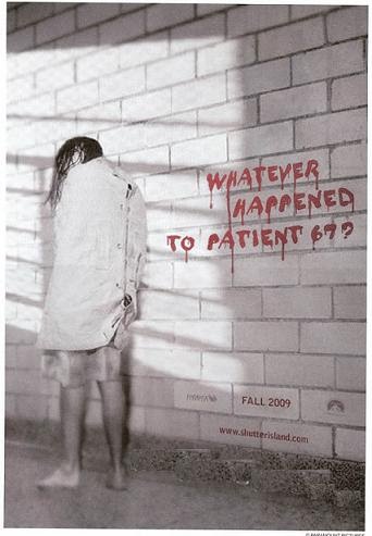
This is a film poster for the film 'Shutter Island'. It shows a woman in a straight jacket with her back to us. We cannot see her face. This tells us that she is in a metal asylum and is a patient there. The writing on the wall informs us that she may be the missing patient and sets the narrative for the film. The wall is white to show that it is a room in the asylum with nothing in. The red blood writing stands out against the white and also tells the audience that it is a gory film. Lighting emphasises the patient, and it looks like it could be a window in the asylum. The other parts of information about the film are also edited so that they are on the wall with the text. The text tells you when the film will be released and the production company. It is a simple, plain poster however sets the location for the audience and also tells some narrative. The red blood stands out to the audience making hem intrigued. By the hair on the woman we can tell that she is not well looked after and the audience fear her.
The main colours are white and red - plain, asylum, forced, blood, pain
Main figure -girl in straightjacket represented photographically
Message - Missing patient, makes you want to know what happened
I decided to look at the Film Gothika because it has a similar narrative to ours. The main character who was a psychiatrist wakes up in the mental asylum that she works in and has no memory of why she is there or how she got there. She starts to see a girl who she is not aware and becomes posessed by the ghost of this girl. Doctors and friends do not believe her therefore she cannot trust anyone and in the end the truth is discovered.
Anchorage, Credits & Title
The three main colours that are used on the text are black, white and red. Black and red are normally associated with blood and anger, and darkness and the unknown. When the anchorage appears they are in white then a certain word at the end is highlighted for example, 'sane' 'logical' and 'rational'. These certain words all relate to the character before she has been put in the mental asylum. This informs the audience that the character will become the opposite of sane and rational. This anchorage appears slowly so that the audience have to time to read it, and it also fits with the pace of shots.
The credits of the actors names are in white and red so that they stand out against the black background. They appear after a shot of the actor so that the audience know who they are.
Finally the film title appears in an eery font that look almost like a child has written it. It first appears white then flashes red and finally fades out to black. I like this effect because it intrigues the audience, it emphasises the connotations that red and black have and lets the audience know that this is a gory and dark film The Dark Castle logo has been faded in to the actors eye which is accompanied by a flash of light and a stab of music which instantly catches the audience attention.
Shots
The first shot of the characters is filmed behind a metal fence emphasising that the patient in the trailer is isolated and could be dangerous. It also establises the locaction of the mental asylum. The pace of the shots are slow to fit with the slow music and the anchorage. The audience are instantly shown who the main character is and what her profession is. The pace then quickens as the protagonist is driving her car in the rain. The camera zooms at a fast pace to a pale blonde girl standing in the middle of the road who is highlighted by the car lights. This intrigues the audience into finding out who this girl is and what she was doing in the road. A close up shot of the strange girl shows the protagonist as a shadow in the background, this makes the audience want to see what the strange girls face looks like as it is hidden by her hair. The audience are then made aware that the protagonist has been put into the mental asylum, you can tell she is distressed by the close up shots of her face.
A lot of close up shots are used to show the expression on characters faces. A long shot of a dark hall with a door at the end uses lighing to highlight the shadow of a girl. We are introduced more to the face of the strange girl by quick close up shots that show her looking dirty and tired. A close up shot the protagonist bending down shows the strange girl standing behind her which scares the audience and makes them fear for the main character. The audience are instantly intriuged by the strange girl and also fear her, a shot of her walking along a hospital corridor in a robotic way shows that she is not normal or human. The shots gradually come to a climax.
Quick and clever editing has been used in a long shot of a hallway with a door at the end showing a shadow of a girl and then the girl disappears. The final shot shows the main character and hands appearing to grab her. All of the shots excite the audience because they want to know what happens next.
Sound
The dialogue throughout is soft and very quiet, to emphasise the quiteness of the asylumthey might be whispering to hide something. A stab of sound and a lightening sound breaks the silence and fades into a slow piano. The audience then hear a scream and car screeches and glass smashing without seeing the actual crash. The sound of the rain, lightening and thunder is used quite a lot in this trailier to that it is not a sunny happy day but a dark gloomy day. Eeery screeches and sounds are used when the main character is shown in the asylum room to emphasise that it is an uncomfortable place to be. The dialogue gives away some of the narrative such as 'your husband is dead you killed him' which excites the audience into finding out what happened. The music changes from slow piano to fast paces almost action like music as the shots get faster. There is a shot of the stranger girl which a close up, we cannot see what she is doing but we can see her moving and the sound of knife slicing to show she is dangerous. With the shot of a man closing what looks like an asylum window, it is accompanied by a sound of a jail door closing to emphasise she is trapped and alone. With the credits, the music gradually comes to a climax and then goes silent. The dialogue 'you should be' is whispered which draws in the attention of the audience as they want to know why she should be scared.
Our narrative is set in a number of different places, one being the mental asylum that our character is situated. We have found a closed asylum in Barming near maidstone. From the pictures we think that this will be an ideal location because it looks eery and looks like a typical horror location, i.e tall, large, dark building in the middle of nowhere. Iron gates emphasise the isolation of the builing and also the feeling of being trapped. We could use this to our advantage and show that there is no sign on escape for our main character.
Mortuary
The worn old buildings of the asylum would also be a good location to emphasise the isolation of our character and seperates her from the outside world.
We need to visit the location to get permission to use the building in our media
This is a scanned A3 piece that we did before we had chosen our final narrative. We had 3 very brief ideas that we mindmapped and these were all different subgenres of horror; slasher, supernatural and psychological.
The slasher idea was based on two girls being kidnapped and tortured by a sick man. We got our inspiration from films such as nightmare on elm street, wolf creek etc. It would be set at night, in an isolated road and their car would break down.They have to find help from the nearest house and they would stumble upon a mentally ill man who was evil. However, we thought this idea was too typical and wasnt very realistic as looking at the codes and conventions of a slasher, would have to involve a lot of gore, blood and disturbing circumstances which we didn't want to include.
Our second idea was another horror sub genre; supernatural. We would use elements such as the devil, spirits, ghosts and 'the unknown'. This narrative would be about a boy who had been contacted by spirits who would tell him what would happen in the future. He was bullied at school because he was able to guess what would happen and people would tease him for being psychic. Throughout the film, he turned evil and would get revenge on all the people that teased him while he was growing up.
Our third idea was a psychological horror that had elements of voodoo in it. Our story was based on a girl that was very lonely and liked a boy at her high school. She got very jealous of the boys girlfriend and would always leave the girl notes to her which would threaten her. One night she found out where the girl was babysitting and went to the house to tell her to leave the boy alone. She threatened her and used voodoo to try and get the girl to obey her but the girlfriend ended up dying.
After a lot of thinking and research, we have decided to do a psychological horror based on a girl from a mental institution. Our idea is based on films such as Carrie, Shutter Island, Girl Interrupted and Gothika. We will use a teenage girl, aged 16 or 17, as our main protagonist who lives in a mental asylum and she runs away. It is a story from her point of view and therefore the audience sympathise with her. Her story is that she is neglected by her parents, very depressed, she self harms and her parents have lied to the police and social services and put her in a rehabilitation centre so they dont have to put up with her. Throughout the time in the asylum she has flashbacks of a fire, candles, running water, graveyards where she has visited a tombstone with a certain name on it and nightmares about a girl who is the same age but she does not know who she is. She escapes from the mental institution because she believes she is innocent and she wants to figure out what the nightmares and flashbacks are about. At the end, there is a twist and the audience find out that the protagonist killed her best friend in a fire and this is the girl that she keeps dreaming about. She started a fire in her best friends room while her friend was in the shower because she was jealous of her family life and took it for granted. Her parents put her in the mental asylum because they found out about the fire through her diary and she was there for 1 year and 3 months before she ran away. She had erased the fire and her best friend from her memory, it was in her unconscious mind.
As our chosen genre is horror, here is a brief deconstruction of Hostel teaser trailer; looking at mise en scene, editing, sound and camera work.
Sound:
The sound for the trailer starts immediately and this is diegetic music that is in a minor key. The instruments playing are string which fits with the conventions of the genre as it is typical horror music. The diegetic music builds tension as soon as the trailer starts and sounds 'scary' which tells the audience what kind of film it is. The non-diegetic sound of the dripping water creates an anxious feeling for the audience and informs them about the setting e.g. run down, not taken care of, isolated. 25 secongs into the trailer, the diegetic music has added pace to it and the audience start feeling more tense knowing that something is about to be revealed on the teaser. There is dialogue from a man in who is tied to a chair, crying, pleading with unseen people to 'let him go'. The audience then know that it is a film about hostages. Further into the trailer we hear a man screaming when his toe gets cut off which makes the viewer jump and become nervous-they are aware that the film will be gruesome and jumpy. After the screaming the sound goes quiet and then gets loud all at once which builds up tension quickly for the audience. The non-diegetic sound of the electric screw driver makes us know how they torture people and how gory the film will be. The music throughout the teaser trailer has a fast pace rhythm and people screaming.
Mise En Scene:
The mise en scene was very informative in this trailer. The setting is very dark and isolated, giving clues that the film is dark and will be about a specific character/few characters. The camera angle where a man is holding a hose washing down something is very bare, empty and this means that nothing will distract the audience. One shot in the trailer is where a man is tied to a chair in an isolated room where there is no light and one small window at the top which is barred-meaning he cannot escape! As we get to know the 'enemies' in the trailer, we see that they are all wearing red overalls, suggesting that they are doing 'dirty work', red signifying that they are dangerous. In a lot of shots in the trailer, the background consists of shelves with tools on. The setting is a very isolated and derelict place. There are men wearing all black in the trailer and they signify being dark and mysterious. The victim is wearing jeans and a long sleeved top which shows he is a normal, anyday man.
Editing:
The editing in the trailer is also typical of the horror genre. It starts with the advertising the distribution logo and this means that the audience knows who produced it. There are two short length shots to start with and this establishes the setting. The credits then read 'there is a place...where all your darkest...sickest fantasies...are possible...where you can experience...anything you desire...where you can...torture...punish...or kill...for a price.' These credits are spread out between shots and images on the trailer so the words are prolongued and arent read all at once. The text lets the audience know what type of film it is. The trailer also states that it is 'Inspired by true events' and as this makes the film seem more realistic, it encourages people to see it. It also shows the audience that it is made by the same people that brought you other blockbuster films that were successful which gives a clue that this film will be sucsessful, 'from the brilliant minds that brought you "cabin fever" "texas chain massacre" and "kill bill"'.
The editing is also very fast pace, the shots are quite short.
Camera:
The camera work is very effective in the trailer and fits with the codes and conventions of a horror genre. The first shot is a long shot of the location, it looks very isolated and two people are seen walking on screen, they look very mysterious and unknown. The close up angle of the water dripping makes the audience nervous. There is a slow pace shot of a topless man with cuts and bruises on him is believed to have been kidnapped, a bag is coming off his head and he doesn't appear to know where he is. There is a shots of tools which indicate they are dangerous and used for torture. A long shot of a man sitting tied to a chair shows that he is being held hostage and wants to escape. The extreme close of the mans toe getting chopped off with plyers shocks the audience and is typical of the slasher horror that is expected to see.
1930s: Gothic sub-genre Cultural changes that influenced this sub-genre: Great depression, War, Technology
Frankenstein
"monster movies"
for example: Dracula & Frankenstein
'The Cabinet of Dr.Caligari'
'Nosferatu'
'King Kong'
1940s: Wartime Cultural changes that influenced this sub-genre: Adolf Hitler, WW2
The wolfman (Adolf means noble wolf in German)
1950s-1960s: Science fiction & Creature features Cultural changes that influenced this sub-genre: Post-war effects, cold war, first sighting of a flying saucer, Roswell incident, Technological change, Atom bomb
threats from the 'unknown' - aliens, mutations of plants and insects (effects of nuclear radiation)
low-budget films. B-movies aimed at teenage audiences
zombies for example: Night of the living dead
demons, the devil for example: Rosemarys baby
non-supernatural psychological horror for example: Psycho
Throughout the narrative of our film, there are mysteries that the audience will find out at the end, hence the idea being a sub genre of horror; psychological horror. The mystery draws in the audience in and encourages them to ask themselves questions throughout the film.
Levi Strauss' Binary Oppositions
Narrative tension is based on opposition or conflict. Looking at the opposites sets values which show the structure of media texts. In our trailer and narrative, there are opposites which tell the audience about the idea.


.jpg)


