Wednesday, 24 November 2010

Website pages 2 and 3

 
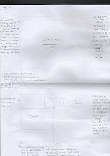
This is a scan of more designs of our website which we have amended. Page two which is at the bottom of the scan shows the page that will come up after the website has loaded. The title is located at the top of the site on the right and the sound is located at the top left. The users will have the choice to listen to the music. We are going to embed the trailer and locate it in the middle of the page. The background of the website page will be black but we re going to input a picture of a hand print of blood to the right of the trailer.
To the left of the trailer, we will have the links that will lead onto other pages of the websites.

Page three of the website shows an example of the pages that will links from the main page .g. the synopsis. We will have the title and sound control in the same place. There will be a different picture on each of the link pages and information regarding the title.

This shows a print screen of a website we have created on wix.com so far. 

Final poster idea

 
We have designed out final poster idea which we will be taking photos of tonight. We have adapted our favourite design from our drafts. It is very similar but we have changed the layout as primary research showed that people thought that it was too 'bottom heavy' and there was nothing at the top so changing the layout spreads out the poster a bit more. The title will be at the top as shown with the tagline on the right hand side. The hand will be very obvious on the page as we have changed the size to make it a little bit bigger. We haven't decided if we are going to do the handprint in blood or steam yet so we will do both and see which looks better and do primary research to see what our target audience prefers. The handprint will be on a window and our actress will be standing outside the window and be seen through the handprint.

Website designs

Loading page

Using Flash, we will encorporate something on the loading page of our website that is very effective rather than using a standard 'loading' line with the percentage of how much is has loaded.

The first idea of our loading page was a syringe that was filled up with blood and then as the page loads, it loses the blood and drops out of the end. When all the blood has gone from the syringe, a scary image will flash up on screen, shocking the audience.

Our second idea was that a stopwatch would be ticking. As the hand ticks round, the stopwatch fills up with blood. This gives the idea that time is running out. Once the stopwatch has been filled up with blood, the page will be finished loading and the main page of the website will appear.

Our third idea which we haven't drawn yet also signifies time running out by having an hour glass filling up with blood instead of sand. This would be effective because it matches our genre and the blood will scare the audience.

Tuesday, 23 November 2010

Poster Ideas

I have designed 4 poster ideas that are drafts for our poster which is part of our promotional package.

The first design on the left is an image of daisy (our main character) looking into the mirror. This poster is effective because her reflection in the mirror is different to reality. The reflection will show her to be a 'normal' teenager so she sees herself as something other people do not. Her reflection will be an innocent young girl who is being taken advantage of and she is being betrayed. The reality will show her to be mentally ill with blood on her face, her hair messed up and greasy, her eyes very dark. Overall she will look extremely scary. The mirror we will use is an old mirror that I (Gabby) have that has cobwebs and dirt all over it. This will help with the mise en scene of the trailer as it has horror connotations and it an antique.

The second design is our favourite. This shows a handprint (which will be in blood or steam, we haven't decided yet). The handprint will be on a window and Daisy will be standing in the background. This is very relevant as the handprint has scary connotations and the blood or steam will look very creepy, meeting the needs of our genre and making it obvious to the audience what type of genre it is. The tagline is also very important so it needs to stand out on the poster. As the poster will be very dark, we think the writing for the tagline should be in white as it will stand out and the colour will contrast with the narrative.

The third poster draft on the left will be an image of a red wall with blood handprints on. We came up with this idea as we like the handprint on the window idea and thought this would be effective aswell. The tagline which is located in the middle of the poster stands out although looks oddly placed. We may try this idea zoomed out so there are smaller handprints on the wall.

The fourth poster draft is a zoomed up picture of an eye which I got inspiration from a poster I found of a film called 'skeleton key'. In the middle of the pupil we would use photoshop to input fire. This is relevant because in our narrative, at the end of the film the audience find out that our main character started a fire to kill her best friend.

(The skeleton key poster)

Research for Website ideas

We have looked at a number of different websites to gain ideas for our own website. We have mainly concentrated on films from our genre. One of the most effective websites we looked at was 'Gothika'.

 Gothika Official Site

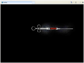
"Loading" feature: As all websites, they take time to load. However to keep the audience interested while waiting, an effective website always has a interesting 'loading' feature while the audience waits. For example, Gothika's website has an image of a syringe as soon as you click onto the webpage. As the home page is loading, the syring loses blood, so show that the time is passing and the page will be loaded after the syringe is empty. This keeps the audiece looking at the screen and waiting for what appears next. We would like to be able to use something like this on our website, and have come up with a few designs of objects that can fill with blood or lose blood to show that the page is loading. We need objects that are to do with our narrative and genre, which tell the audience something about the narrative, but not too much.

 As soon as the page finishes loading, an image appears, flickering, of a girl in a lit doorway quite far away. This immediatley grabs the audience's attention as it happens quickly and only appears for a short while. We are hoping to create an image that will appear quickly to scare the audience.

The home page shows an image of the main actor, Halle Berry, in distress, with a girl behind her in blue lighting. It is simple yet effective. The title of the film is at the top of the page written in eery font. The colour scheme is clearly black and blue on this website, and does not use the conventional colour of blood for a horror movie, like it did with the syringe. This shows that the film is more pyschological than horror. The menu can be found in the top left hand corner and is easy to use. The font is simple and clear for the audience to read. It uses animation as it flickers when the mouse hovers over it.

We are hoping to create a website that keeps the audience interested and has a lot of features that shows they would be able to interact on the website.

Tuesday, 16 November 2010

Website

We have decided to use Abode Dreamweaver for creating our website for the promotional package. This is good because we have it on computers at school and I (Gabby) have it at home in case me and annie need to do work on it when we cannot access school computers. We have been looking for tutorials on the internet to try and get ourselves familiar with it. I have now set up the website although it is only in its first stages and i have set it live on the internet through a webhost.


This is what we have done so far and these are screenshots of me setting up the homepage of the website and making it live on the internet.


Film title & font

We have finally decided on a film title for our trailer. We have chosen 'twisted truth' because it insinuates that there is a twist within the film that the audience do not know about, therefore they can interpret it in different ways. It does not give too much of the narrative away.

We then found a font to go with this title from a website. We feel that the font fits with the title because it has random capitals, it is not a consistent size and letters are often reversed. The letters joined together by a line that reminds us of heart rate or barbed wire.

Ancillary tasks

Apart from our teaser, the rest of our promotional package is a website and a poster advertising our film. We have done draft designs for our website and poster and will do some primary research of our target audience to get ideas.

As shown, the loading page will be simple but when the loading gets to 100%, our idea is that something flashes up on the screen to scare the audience. The loading writing will be in red to match the connotations of our genre.

The second page consists of the title of the film and the trailer. The background will be a picture we take which we have a few ideas for:
-a bloody handprint on a window with daisy standing subtley in the background
-daisy sitting on the floor
-daisy looking in the mirror, her reflection seems normal but in real life she has an evil look on her face with blood and bruises on her.
We will also have links on this page linking to other pages of the website which will show photos, information, synopsis etc.

Thursday, 11 November 2010

Film poster inspiration


When desiging our ancilliary tasks, we need to think about drawing our audience in. We are designing our film poster and this is our first draft. We are focusing on the title being the main focus point, and there will be a small image that draws the audience closer in such as a handprint or a reflection. The poster will show an image of a window that will either show bright light in the background or darkness so that the font of the title will be emphasised. We have found our chosen font from a website, and after we have taken the photo of the window we will play around with editing to put the font as if it on the window. Next to the film title, will be a bloody hand print that we will create ourselves. We will play around with the angle of the hand print and the transparency of it. Then at the bottom of the poster will be the date of the film release which will be the same as the film title font. The rest of the text such as production company etc. will be in a normal font that we are yet to decide. All of the font will be red to fit with the connotations of horror.


Inspiration from other posters


Our idea for the window and the hand print came from these two posters whilst we were researching film posters. We like the bloody hand prints on the poster on the left and think it will look really effective as it will not give too much of the narrative away. The audience will know that it is a horror film that involves blood however all they have is a hand print which leaves them to guess what happens. We also liked the poster on the right because the background is not clear to the audience and that is what we want our audience to be drawn into. We want to leave them guessing.

Film covers and fonts

When thinking about the design of our poster and website, we decided we needed to look at previous films with a similar genre which we can get ideas from and compare them to see what is common etc. Looking at hostel, shutter island and the fourth kind we have found similar traits but obviously because they are all different types of horror films, they all use different ideas.

Looking at this cover, people can tell its a horror film as the colours used are red white and black. The image of leonardo dicaprio tells the audience he is the main character and his name is the only one displayed on the cover which insinuates he is very important and a known actor so will appeal to people.
The title, in red, stands out against the dark background colours and fits with the codes and conventions on horror movies representing death, blood etc. The date on the poster is also in red, standing out inbetween all the white writing and dark background.
The picture of the island and rain has horror connotations. The sea looks choppy, the weather looks torrential and its represents bad things and danger.
The tagline is also very effective as it makes the audience asks themselves questions, 'who is missing', 'why are they missing' etc.


This film cover us for a slasher film called hostel. At first look, the quote at the top of the poster tells the audience what kind of film it is.
The red background is effective and is a gothic colour representing blood, rage and death which are big connotations of the film. The writing against the red background is minimal but relevant and they have only included important information. The darker patch of red reminds me of blood and as there is quite a significant amount of dark red, it may shows a lot of blood.
The age certificate tells the audience it is unsuitable for under 18 year olds insinuating it involves a lot of gore, violence and disturbing images.


Although this is not a film that links with ours apart from that it has horror connotations, we still thought it would be good to look at different posters as well. This is a film based on alien invasion and taking over the body.
The picture covering the whole of the poster draws the attention of the audience as it is a disturbing image that is not seen in every day life.
The title standsout and matches the genre with 'alien' colours etc.

Tuesday, 9 November 2010

Websites

Following our research for websites.....

We've been looking at websites of films that are the same genre as ours. They are all similar in terms of colours e.g. black, red, eerie colours that can make the audience 'nervous'.
This is the loading page of a website, looking at it quickly it looks like a skull but if you pay attention, it is the character al linked together. This is a cool effect and we would love to use something like this that gives two different scary impressions.


This is another page of the descent website. It is effective because there is a large picture of one of the characters and you can see she is showing a worried emotion. The dark background makes her stand out and fits with the genre and codes and conventions of the film.

Editing

We have made alot of progress with our teaser trailer and have 45 seconds of the final version so far.

We have started to add music as well and our drone is from iMovie sound effects. Another part of the sound we have done is from our recording. To make it seem eerie and creepy, we have reversed the sound of people talking so that no sense can be made but the audience will be able to tell people are talking. We did this using the tools on iMovie. We edited this to have it start when our character is asleep so people will know she is dreaming.

Thursday, 4 November 2010

Fonts for title

After researching on a known website called dafont.com, we have found a few font ideas that fit with our codes and conventions and think are really good. We wanted the font to be different rather than a classic horror font.


Progress

We are filming the last shots tonight (hopefully) at a location in Keston Park. It is an abandoned house which we are using the inside of.
I researched editing techniques and found a video tutorial on youtube which has helped us enormously of how to use really good effects. An effect we really wanted to encorporate into our trailer was blood appearing on our characters face and we have found a way to do this and hopefully it will be successful.

Tuesday, 2 November 2010

Inspiration


This is a trailer for a new TV series which uses an effect we would love to use in our own trailer. Different faces of pretty girls appear, they start off happy and smiling and then slowly their face loses colour and their expression changes to sadness, fear or pain. Writing that looks like it has been scratched into their skin appears on different parts of their face like their forehead, cheek or eyelids.

We think that the contrast of the pale skin looks really effective with the scratch marks. The words that appear also reveal a secret about each specific girl so we could this effect to reveal a little bit of the narrative of our trailer. We can make our actress look distressed as this secret she is holding is hanging over her.

In order to make this work, we need to play around with the editing or the way we shoot it, which means we would have to use effective make up, draw a few bits of the word, film, stop, draw some more letters, film, stop and so on. We will play around with this effect so that we can make it look as effective as possible to the audience.

Monday, 1 November 2010

Website

Obviously we have to include pictures on the website and the one I have for the main one which will take a a large part of the screen is of daisy while we were filming her 'nightmare scene'. It has dark lighting and you can see her very clearly. The make up I did makes her look tired and weak.